Ready. Set. Fight!
|
NO SURRENDER
|
Ready. Set. Fight! | NO SURRENDER |
What is NO SURRENDER?
In the current political climate, queer communities have been maliciously harassed and oppressed, some cases even appearing on the news. NO SURRENDER is a hypothetical nonprofit organization that locally sources and provides self defense lessons and a safe space for queer youth. In times like these, it can be really scary to be queer, even more so for minors. We can gather strength in numbers, which is why NO SURRENDER greatly values community and practicing self defense.
The Process
The first step of the branding process was designing the logo, which was sketched up on a napkin to look like a person throwing a punch. The initials of the company, “N S” were arranged to reflect the punching man, thus creating the iconic no surrender logo.
Then came the color palette and the grab bags items, which were both hand sewn and 3D printed. The bag is a simple pull string gym bag that can hold all of your exercise equipment while you are taking classes with NO SURRENDER instructors or your local gym.
The keychain is a mini 3D printed replica of the iconic NO SURRENDER boxing glove imagery. The initial design of the keychain included a squishy version of the glove, but that was passed on. The total printing time for one of these gloves was about 2 hours, not including the super glue attachment of the hook clasp.
The Solution
The impact of NO SURRENDER is largely due to the grab bag items, which were a fan favorite. The brand design is both powerful and sympathetic to a relatable cause, which brought more attention to the oppression faced by the LGBTQIA+ community in Los Angeles and surrounding local counties. The largest thing to take away from this branding project was that even if you cannot donate monetarily to a cause, there is always something you can design or hand craft that will help equally, if not more.

Photograph of 3D printed keychains used in swag bags

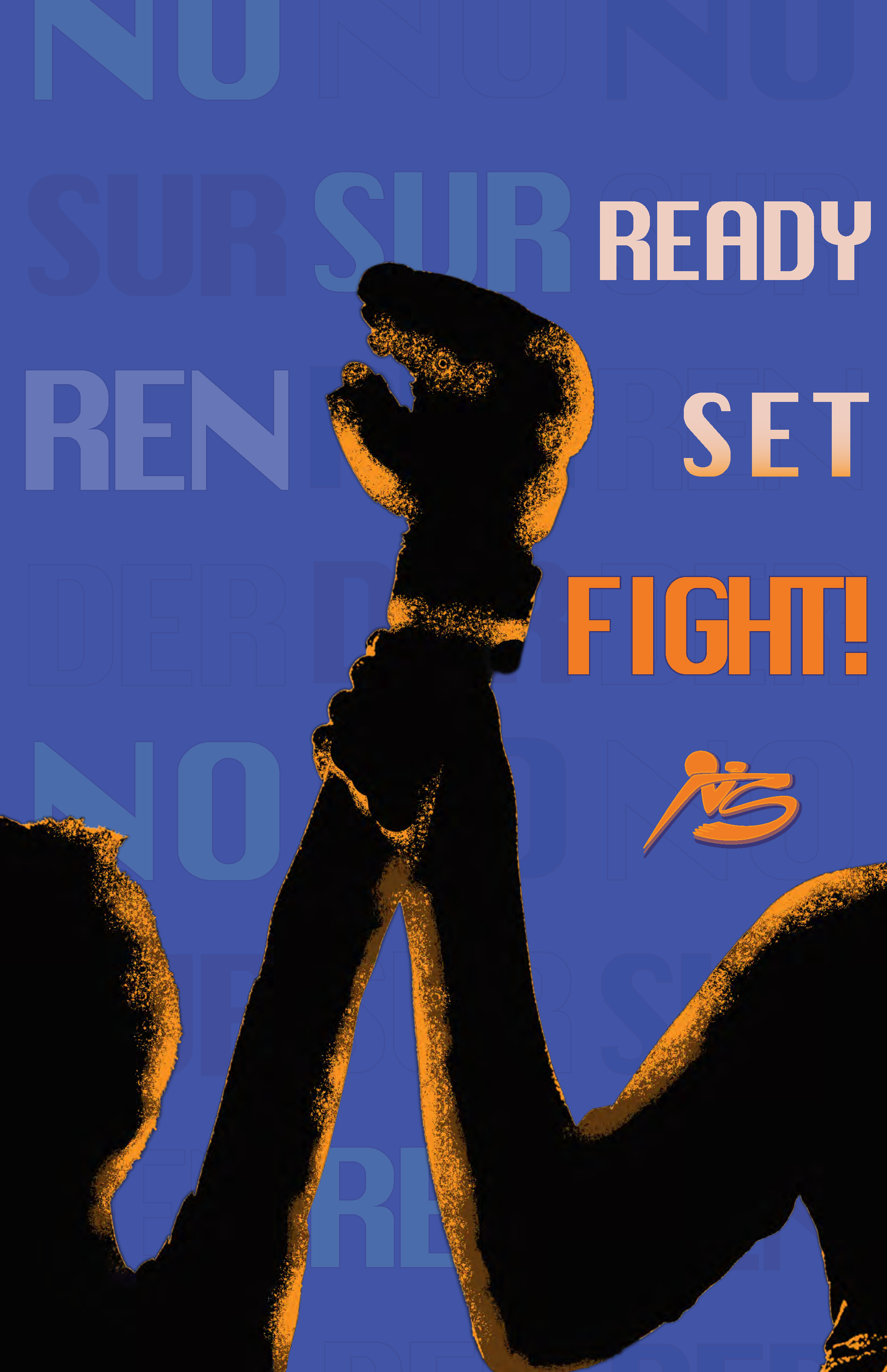
No Surrender Blue Poster

Promotional pull string No Surrender swag bag

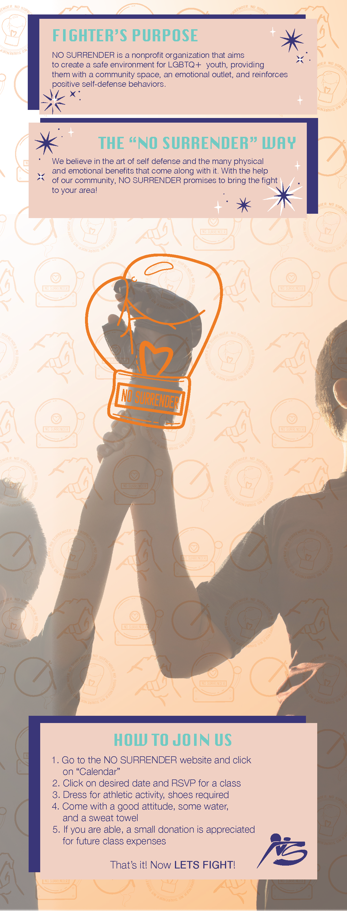
Inside of No Surrender Brochure

No Surrender Outside of Brochure folded

Outside of No Surrender brochure


